Stock art is a vital part of the tabletop RPG market. The concept, solid artwork to spark adventures without breaking the publisher’s budget, is one of the bedrocks of the RPG industry. Stock art allows creators to publish professional games without mortgaging their home. These “generic” (yet, not generic) images provide visuals at a price point that allows projects ranging from simple one-page PDFs to full-color tabletop roleplaying games from major publishers to be visually inviting.
 Among the best known stock artists in RPGs are Tithi Luadthong, JEShields (who I’ve interviewed here and here), Storn Cook, Dean Spencer, Felipe Gaona, Bryan Syme, Rowan Withnell, Joyce Maureira, Jeffrey Koch, and Rick Hershey. Rick owns Fat Goblin Games and runs the Fat Goblin Games Patreon where you can you can fill out your fantasy stock art needs. I’ve talked about some of Rick’s stock art plans (here) as well as his art at d20 Radio and during my Love’s Labour’s Liberated (5e) RPG Zine Kickstarter. Since I am running a new Zine Quest Kickstarter, Love’s Labour’s Liabilities, I’m using artwork from Rick Hershey and other sources. But, I like to tweak the stock art I purchase to make it unique to the project I’m working on. To that end, this article is about some of Rick’s pieces (as public domain) I’ve adjusted for the zines I’ve worked on.
WHY CHANGE IT UP?
When using licensed art, whether stock or commissioned pieces, most publishers buy the work and use it as designed, and there’s no reason not to. The artist is the visual expert, that’s why you paid them, and there’s no reason to alter their vision. In my case, I was working on LLLiberated and LLLiabilities, both black and white zines, which depend on stock art and public domain pieces to give the book their look. But, I didn’t just want to run existing art and be done, I wanted the books to look new even if it was recycled. Thus, I took color pieces, converted them to tone (clusters of black dots that give the illusion of grayscale), and made other alterations within the guidance of each piece’s stock art license to craft, not original, but variant works.
LICENSES
 Let’s talk about stock art licenses. When you buy stock art, you’re purchasing a limited license to use the art for a specific purpose. As a publisher, that license is critical because it gives you the rules as to how you can use the artwork. Some licenses are broad allowing you to use the art as you see fit, some have limits that require you to use the art as created. This is important, if the license does not allow you to alter the image, you cannot legally do that. Read and understand the license before you make any alterations to the artwork.
One of the reasons I’m doing this article is that the pieces I purchased from Fat Goblin Games include a broad license that allows you to use their artwork to meet your needs as a publisher. You can download their license here to learn more.
HAN SHOT FIRST
I want to state this emphatically, the original artwork by the original artist is always better than any alteration. Rick Hershey’s work is superior to mine in every way. If the zine had been full-color, I’d have gone with his work because it shines so much more that my variants. This is my proclamation, the art I licensed was great, and my alterations only diminished the singular work, in my opinion. This applies to all of the artwork I tweaked, whether Rick’s, another stock artist’s, or a piece pulled from the public domain.
That said, let’s dive into some of the works I switched up.
THE SORCERER BY RICK HERSHEY
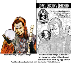
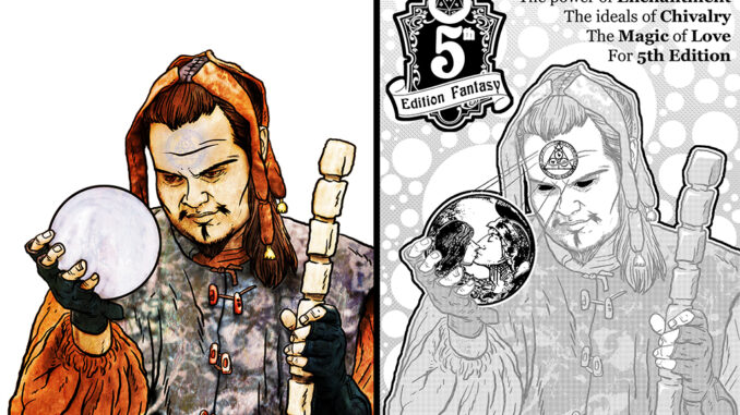
Looking at Rick’s original work on this sorcerer with the crystal ball, I love the size of the figure, this guy is broad with shoulders that could carry armies. From those shoulders to the fingers, they have a cartoony yet living quality to them; Rick nailed the hands. The amount of engagement the sorcerer has with the crystal ball speaks to his intentions, there’s something going on here. But it’s the circles you see on the crystal ball and his forehead tattoo that makes this fascinating. Is he scrying? Is he communicating? Is he being controlled?
This image offers a lot of possibilities and I knew it was the perfect image for the back cover of LLLiberated. When I did my take, I wanted to bring out those circles through the background and give my focus to the crystal ball. To that end, I added an element from my version of Isobel Lilian Gloag’s The Kiss of the Enchantress to the image (more on her work below). In addition, I put in Rick’s 5th Edition Fantasy logo, which deserves a shout out.
DRYAD DRUID BY RICK HERSHEY
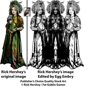
Rick’s great hue choices for this one give it life and depth. First, the burgundies in the dress contrast with the hunter greens and yellows and make me wish that more colorists dared to combine colors that perfectly. The colored lines on the skin say bark and that she’s a dryad without requiring her to hug a tree. But, the best element? The owl. It’s almost lost among the other great components of this artwork, but it’s worth looking for. Rick’s owl is fantastic and makes licensing this art more of a two-for-one, in ways.
For my part, I pulled out the line art and then had a happy accident after I flipped the image and dragged it across the original, it turned into the three hags. It looked cool enough that I was happy to leave it as it was.
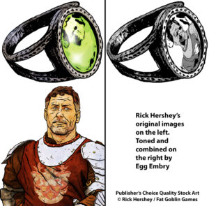
THE KNIGHT IN THE RING BY RICK HERSHEY
I bought one of Rick’s collections of rings and this one spoke to me, but I wanted an image to place in the setting. I’d used his knight on the campaign page for LLLiberated, so I thought it’d be cool to combine these images. In the end, the strength of Rick’s art is clear when you can combine two of his pictures and they look perfect together.
THE KISS OF THE ENCHANTRESS BY ISOBEL LILIAN GLOAG
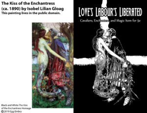
Up to this point, I’ve talked about Rick Hershey’s work. For this final piece, I’ll talk about Isobel Lilian Gloag (1865 to 1917), a female, English, Pre-Raphaelite painter whose works from the late 1800s speak to me. I recreated her painting, The Kiss of the Enchantress, as a black and white cover for the LLLiberated. It has all of the elements of the zine, the cavalier, the enchantress, and an expression of romance in their kiss. I hope I did justice to the original.
All of the other art that I shared in this article were “made” from Rick’s pieces using Photoshop tools like the “Magic Wand,” “Lasso,” and “Transform” to select areas and replace them with ink or clusters of dots to create the illusion of grayscale. For Isobel’s work, I drew it digitally which is a different amount of effort. I choose clean black and white without tone; it does not have the fantasy of her original, but I am proud of the work.
LOVE’S LABOUR’S LIABILITES & THE MAGIC CIRCLE
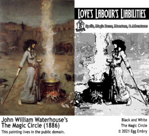
For the cover to the second Love’s Labour’s zine, I did an inked and toned version of John William Waterhouse’s The Magic Circle. Of all of the pieces, I feel this is the one where the original is so superior to my work that I worry John William Waterhouse’s ghost will haunt me! His has the feel of a scene from a movie, something coming to the cauldron and it’s just off-screen. Such an amazing piece, which is why I used it as my inspiration for the cover to Love’s Labour’s Liabilities. I feel that the cover speaks to the adventure and fantasy of Dungeons & Dragons, as such, I’m happy to have this cover.
If you’re looking for suitable stock art, I highly recommend Fat Goblin Games page at DriveThruRPG and their stock art at the Fat Goblin Games Patreon.
If you’re interested in seeing more of the Love’s Labour’s zines, check out the Kickstarter.
Love’s Labour’s Liabilities – A 5e RPG Zine Quest from Egg Embry Publishing
 End Date: Sat, February 13 2021 11:59 PM EST.
- System: Dungeons & Dragons Fifth Edition
- Zine Price Points: $5 for the PDF, $13 for the PDF and print versions of the zine
“A 5e RPG Zine About Love. PDF Version Delivers on Valentine’s Day!”
Egg Embry participates in the OneBookShelf Affiliate Program and is an Amazon Associate. These programs provide advertising fees by linking to DriveThruRPG and Amazon.
Latest posts by Egg Embry (see all)
- New Gamemaster Month 2023 - January 20, 2023
